You can buy an awesome theme for WordPress. But spending money is painful.

So if you are as cheap as I am, you might say to yourself, “Self, why am I so cheap?”
No, wait, you might wonder how you can spruce up the default theme without breaking the bank.
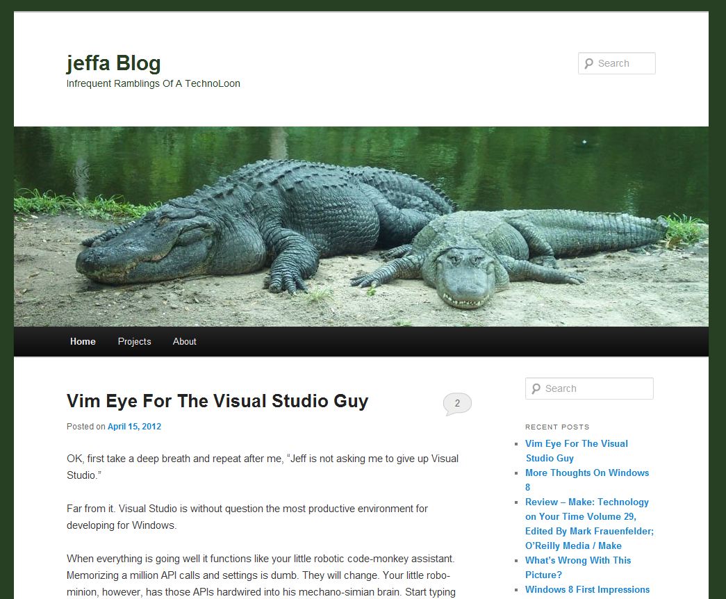
That's exactly what I did for this blog. Assuming I haven't changed it by the time you read this…
Two very quick, very simple things you can do are:
- Add a background image
- Color coordinate your site with your banner image
Background Image
The right background image can make your site POP. Zing even.You can pick a large image to fill up the background or a small image that can be tiled.
Both approaches can work, but the large image needs to be small enough in size that it doesn't choke your reader's bandwidth.
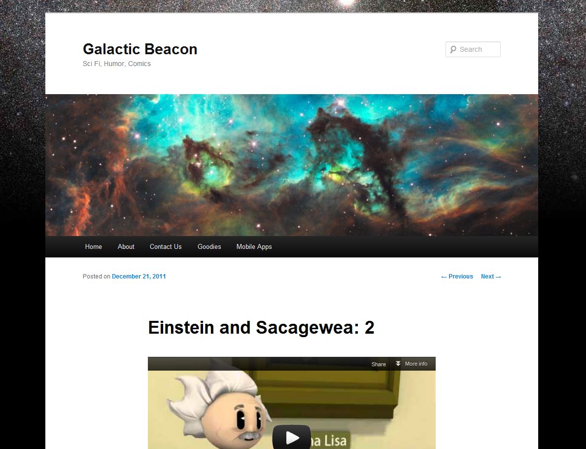
For this site I chose to use a flat color for the background, but for Galactic Beacon I used a large image I grabbed from NASA.

That image is a 1024 x 768 picture, but I jacked up the compression/lowered the quality so that it is only 54 KB. Since it is in the background, I don't need it to be super hi fidelity.
I also set it to repeat horizontally and NOT scroll.
The effect is that it stays put and the content scrolls up over it.
Both sites use the TwentyEleven theme that is the current default for WordPress.
Another little trick is to use your image editing software and put a gradient over it so that it blends down to your background color towards the bottom. That works whether you let it scroll or not. The effect is that you don't have to have a staggeringly tall image.
Color Coordination
The next tip is really simple, but can make your site look like someone way smarter designed it. Well, smarter than me, at least...Here's the 30 second version:
- Pick banner image you like
- Submit that image to Kuler
- Pick a color set you like
- Set the theme colors to those colors
For this site I used a picture of a couple gators I took at Busche Gardens in Tampa several years ago. Kuler picked a palette that I applied to the background color, text, etc.
I'm no designer, but I like the way it turned out. The picture seems to blend into the background of the site.
That pretty much exhausts my knowledge of design.
I'd love to hear what you think of these ideas and if they are helpful.
Understand that I get a TON of spam comments, and I don't let ANY of them through. I moderate 100% of the comments on this site. Do leave a comment, but don't be surprised if it doesn't show up.
Good luck and happy blogging.
